our YouTube thumbnail is the first impression your viewer gets — and in just one second, they decide whether to click or scroll away.
That’s why creating a perfect thumbnail isn’t just about design — it’s about strategy, emotion, and storytelling.
In this post, I’ll show you how I create eye-catching YouTube thumbnails that boost clicks and make your videos stand out from the crowd.
🎨 1. Understand What Makes a Great Thumbnail
A perfect thumbnail should:
- Be simple yet bold
- Clearly show what the video is about
- Use contrast colors and clean composition
🧠 Tip: Never overload your thumbnail with too much text or too many images — focus on one strong visual idea.
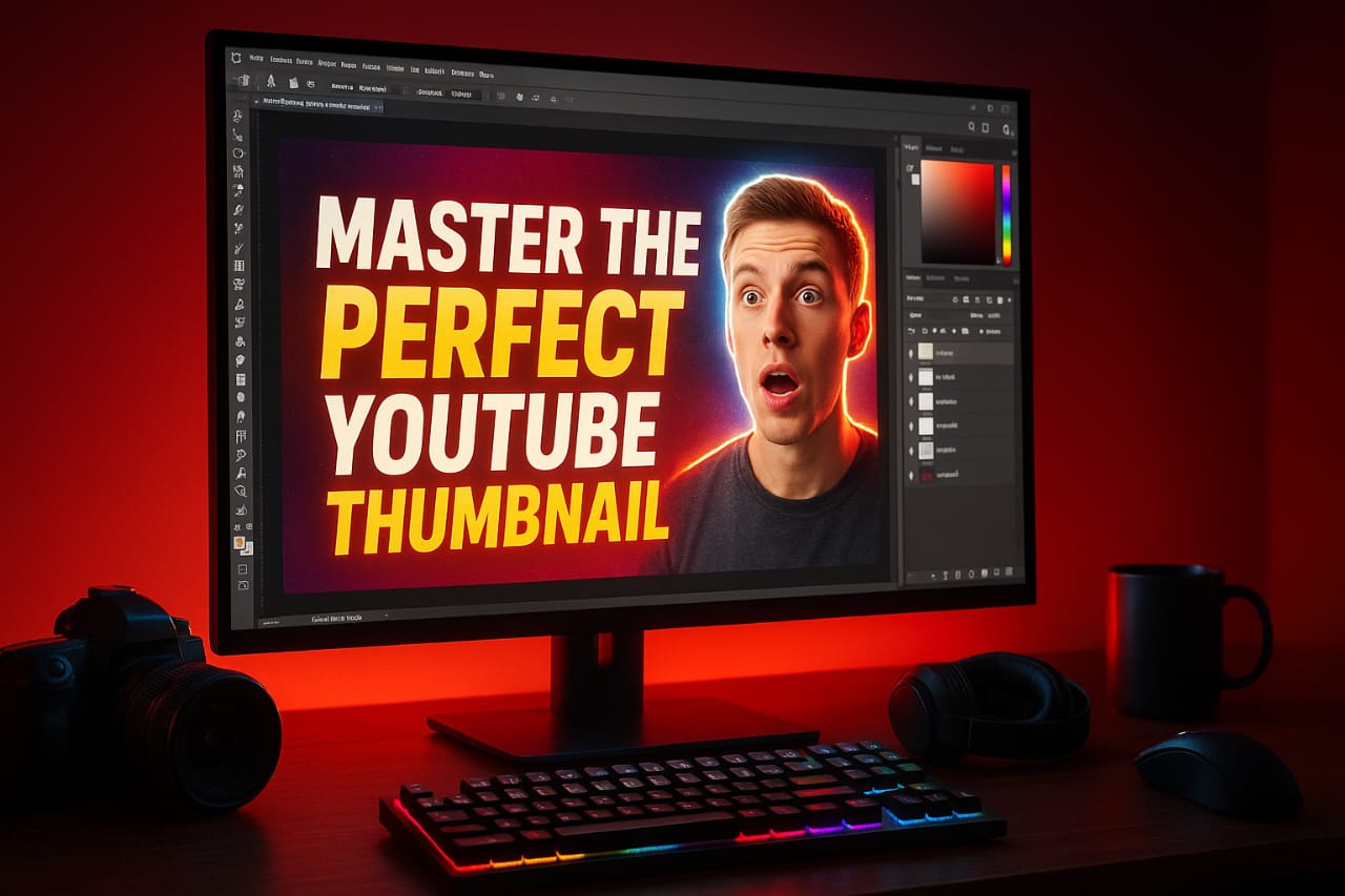
🧍 2. Use a Clear Subject (Human Faces Work Best!)
Faces with expressions grab instant attention.
Emotion helps viewers connect with your content before even watching it.
🧠 Tip: Try adding your own face with a strong reaction (shock, excitement, curiosity). Use the Liquify tool slightly for exaggeration — but don’t overdo it.
🖌️ 3. Choose the Right Colors
Colors can make or break your thumbnail.
Bright, contrasting colors like yellow, red, blue, and white stand out more on YouTube’s dark background.
🧠 Tip: Avoid too many dark or dull colors — they blend into YouTube’s interface.
🧱 4. Add Bold Text & Clean Fonts
Use 2–4 words max in bold font.
Keep it readable even on small screens (mobile users = 70%+ of your audience).
🧠 Tip: Fonts like Bebas Neue, Anton, or Montserrat Extra Bold look professional.
Use a light drop shadow or stroke to make text pop out.
🧰 5. Tools I Use for Thumbnail Design
Here are my favorite tools for professional thumbnails:
- Adobe Photoshop – for custom high-quality design
- Canva – for quick edits with templates
- Photopea – free online Photoshop alternative
🧠 Pro Tip: Always keep your thumbnail size 1280×720 pixels (16:9) and file under 2MB.
💡 6. My Personal Thumbnail Workflow
- Capture key frame from video
- Import into Photoshop
- Cut out subject (using pen tool or remove background)
- Add background + gradient color
- Insert big, bold text
- Apply slight color grading for cinematic look
- Export at 1280×720 resolution
🧠 Result: Your thumbnail looks cinematic, eye-catching, and clean — perfect for high CTR.
🚀 7. Analyze and Improve
Use YouTube Studio Analytics → “CTR” section to see which thumbnails perform best.
Keep testing different designs (A/B testing) and track which style gets more clicks.
💬 Conclusion
A good thumbnail can multiply your video’s reach — a bad one can bury it.
So invest time in your thumbnail design just like your video edit.
Every time you create one, ask yourself:
👉 “Would I click this?”
If the answer is yes — you’re on the right track!
Follow Yash Edits for more content on video editing, design, and creative growth. 🎬